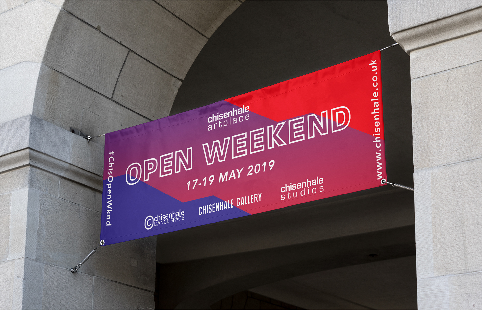
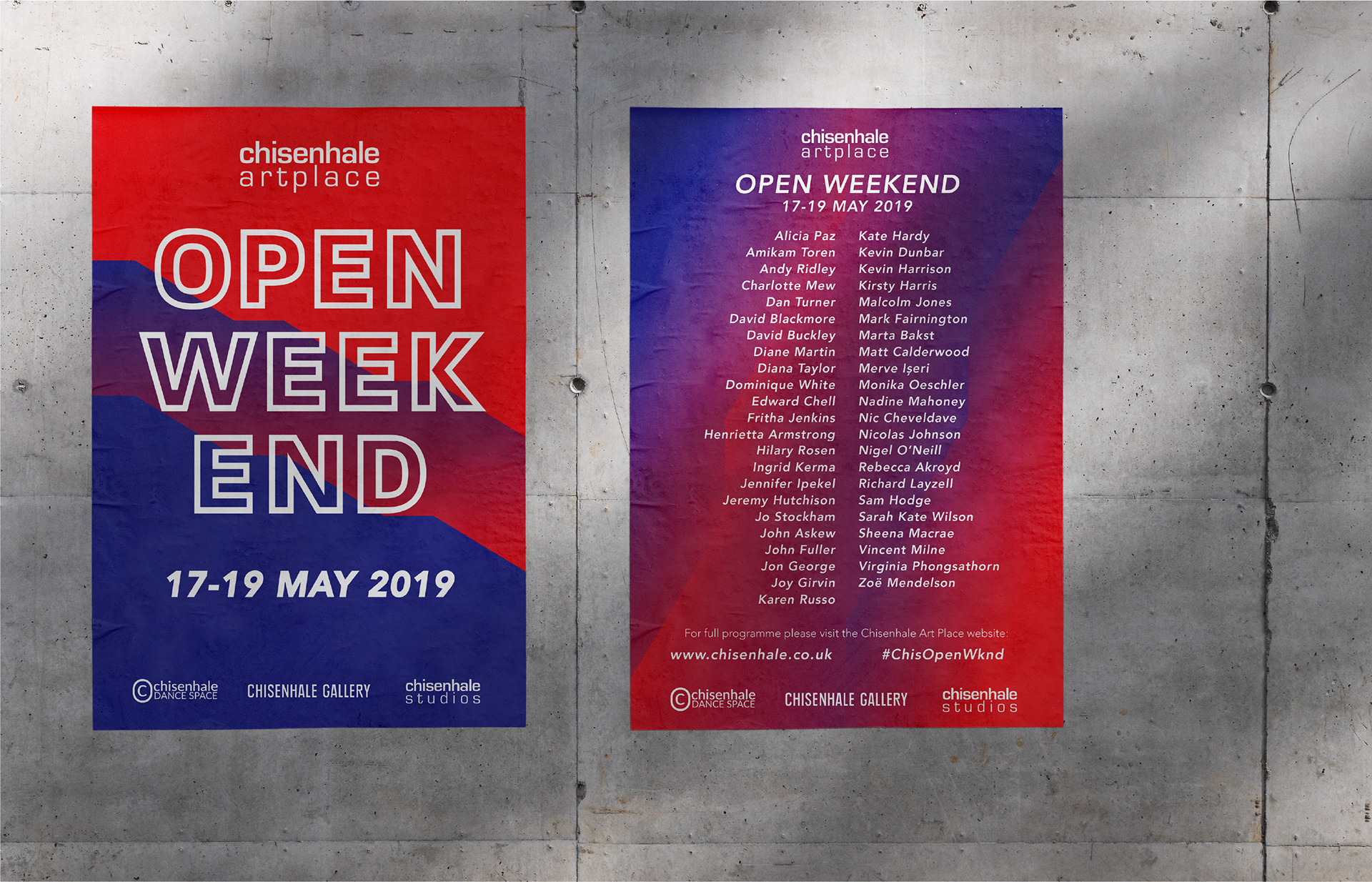
I got to work with the ace Chisenhale Artplace on the identity for their Open Weekend. The shape of the red fire escape that runs across the outside of the building had stuck with me from my first visit several years before, so it felt like an interesting starting point for a motif.
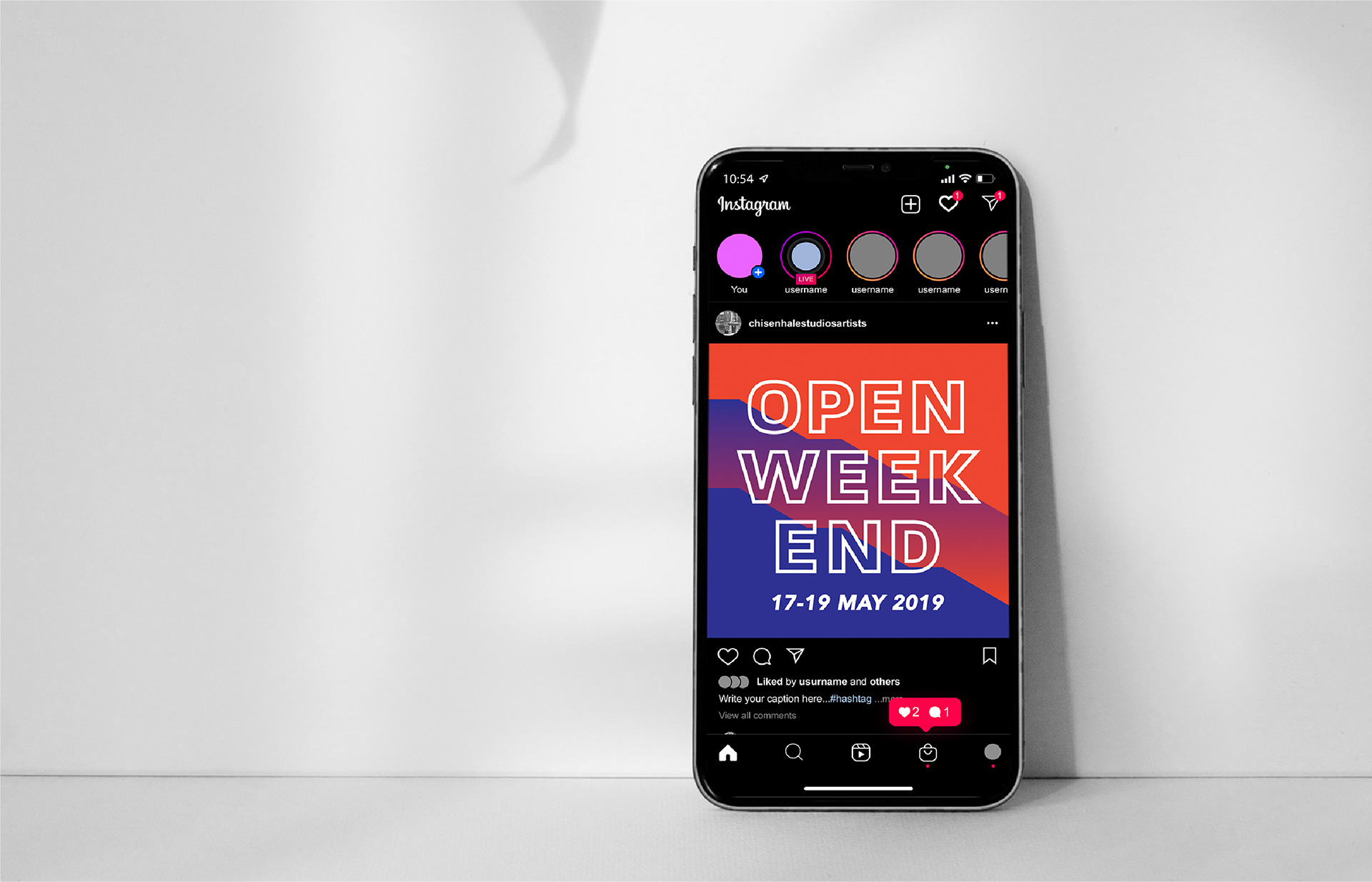
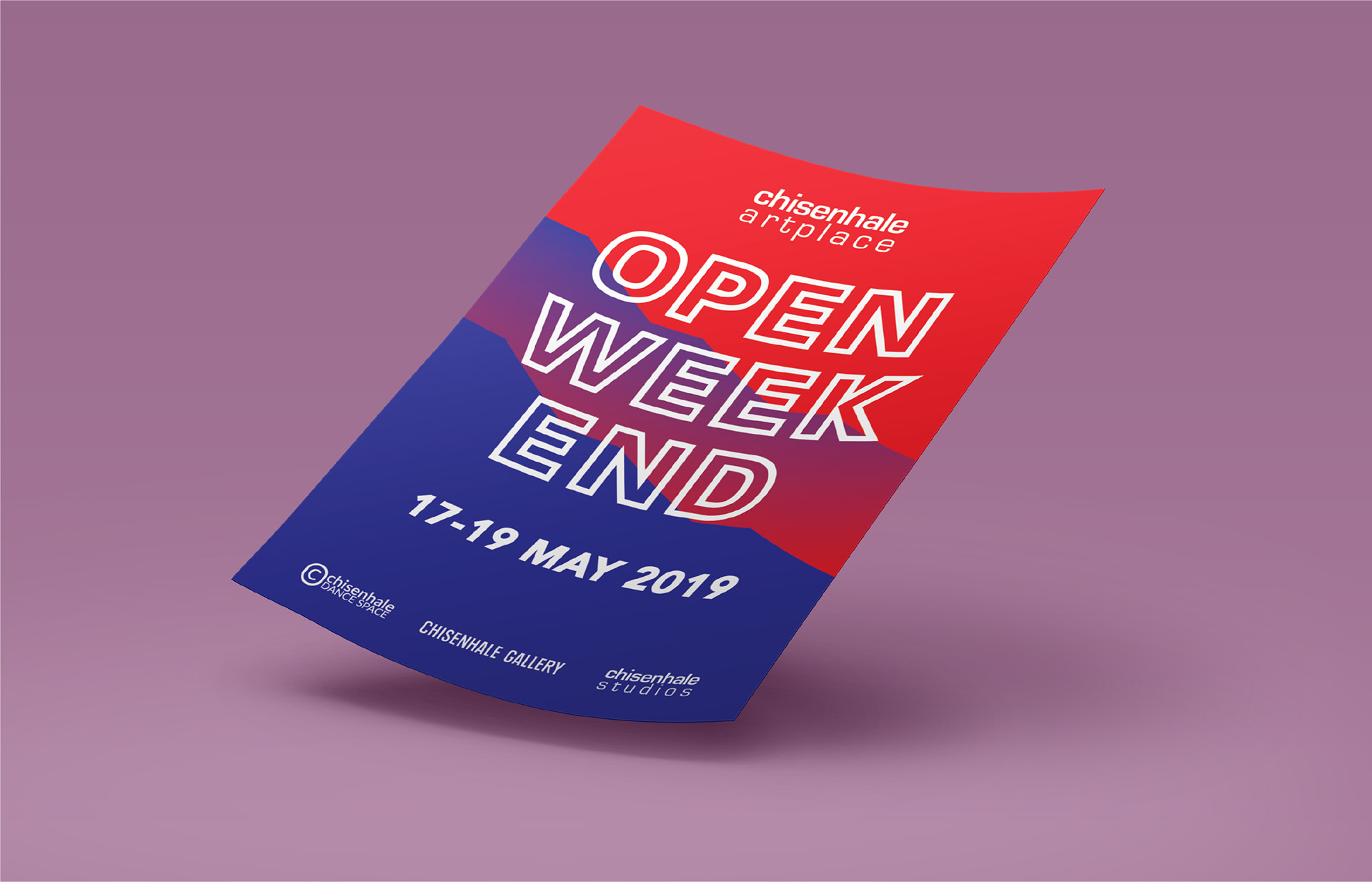
It became a form that ran across all the materials, alongside a super bold colour palette and typography. This was all applied to a flier, banners and some social graphics to advertise the open weekend.